Course contents
Reading a price chart
A chart plots price over time. Line charts show closes simply, bar and candlestick charts show the open, high, low, and close, and candlesticks are the usual choice because they are quickest to read.
- Read the axes of a chart
- Compare line, bar, and candlestick charts
- Explain why candlesticks are the usual choice
Before you can analyse anything, you have to read the chart, and a chart is simpler than it looks. It is nothing more than price plotted over time. What varies is how much detail the chart shows, and that depends on which of three common types you are looking at.
The two axes
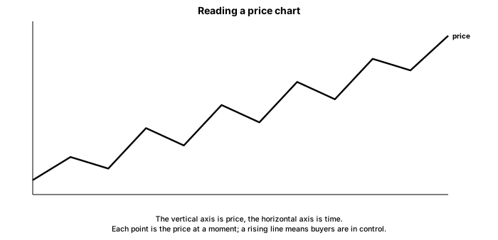
Every price chart shares the same frame. Time runs along the horizontal axis, left to right, from older to newer. Price runs up the vertical axis. Each mark on the chart, whether a point, a bar, or a candle, represents one period of trading, a day or an hour or a minute, set by the timeframe, which the next chapter covers.
Three ways to draw price
A line chart simply joins the closing price of each period into a single line. It is the cleanest view, good for seeing the broad trend at a glance, but it throws away what happened inside each period.
A bar chart shows more. Each period is a vertical bar marking the high and low, with small ticks for the open and the close. In one bar you can see the full range and where price started and finished.
A candlestick chart shows the same four prices as a bar, the open, high, low, and close, but draws them as a body with thin wicks, and colours the body by whether price rose or fell in the period. It carries no more data than the bar, yet the coloured body and the wicks make direction and range jump out, so most traders read candlesticks by default. The next chapter takes a single candle apart.
Candlesticks won for a simple reason: the eye reads them faster. A wall of green and red bodies shows you the balance of up and down periods at a glance, and the length of bodies and wicks shows conviction and rejection without conscious effort. That speed matters when you are scanning many charts.
What to carry forward
A price chart is just price against time, and its three common forms differ only in detail. The line chart traces closing prices and shows the trend cleanly, the bar chart adds the open, high, low, and close, and the candlestick chart draws those same four prices as a body and wicks that the eye reads at a glance, which is why it is the default. Mind the scale, and remember the chart records what happened rather than what will.
Since candlesticks are what you will mostly read, the next chapter takes a single one apart to see the story inside it.