Course contents
Seeing the data
A chart reveals what a table hides, and Python's plotting tools draw a price series, overlay a moving average, or show a distribution of returns in a few lines. Visualising data is part of understanding it.
- Plot a price series over time
- Overlay a moving average on the price
- Draw a simple chart and save it to a file
You have computed returns, trends, and volatility, but rows of numbers are hard to feel. A chart makes them obvious: a trend you would squint to find in a table jumps out of a line, and an odd value that hides in a column shows up as a spike. Visualising data is not decoration; it is part of understanding it, and a first check on whether your numbers are sane. Python's standard plotting library, matplotlib, draws a price and its moving averages in a few lines.
Drawing the price with its averages
This program loads the sample, computes two moving averages from the last chapter, and plots all three on one chart, saving it to a file.
# Draw the price with its moving averages and save the chart to a file.
import pandas as pd
import matplotlib
matplotlib.use("Agg")                     # save to a file; no screen needed
import matplotlib.pyplot as plt

df = pd.read_csv("sample_prices.csv", parse_dates=["Date"], index_col="Date")
df["sma_20"] = df["Close"].rolling(20).mean()
df["sma_50"] = df["Close"].rolling(50).mean()

plt.figure(figsize=(10, 5))
plt.plot(df.index, df["Close"], label="Close", linewidth=1)
plt.plot(df.index, df["sma_20"], label="20-day SMA")
plt.plot(df.index, df["sma_50"], label="50-day SMA")
plt.title("Close with moving averages (illustrative sample)")
plt.xlabel("Date")
plt.ylabel("Price (rupees)")
plt.legend()
plt.tight_layout()
plt.savefig("plot_prices.png", dpi=110)
print("Saved plot_prices.png")Saved plot_prices.png
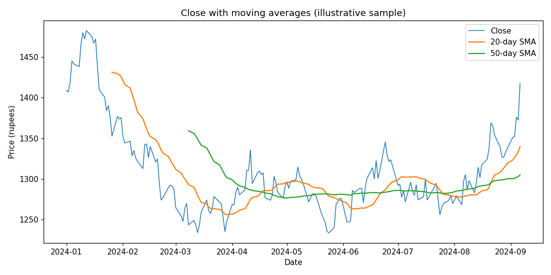
The pattern is simple and repeats for almost any chart. You call plt.plot once for each line, giving it the dates and the values and a label, then add a title and axis labels, a legend to name the lines, and finally save the figure to a file with savefig. The result is the chart shown: the close as a thin line, with the smoother 20-day and 50-day averages riding through it, and you can see at a glance what the table only hinted at, the price dipping well below its averages in the middle of the period and then climbing back above them by the end. The lag of the averages, described in words last chapter, is visible here as the smooth lines trailing the turns in the price.
A note on showing versus saving
One small technical point, because it trips people up. On your own computer you would usually call plt.show() to pop the chart up in a window, or, in a notebook, the chart appears inline automatically. This program instead uses a non-interactive setting and savefig to write the chart to an image file, which is how you produce a chart to embed in a report, a webpage, or, as here, a lesson. Both are matplotlib; one shows the figure, the other saves it.
Beyond a line chart, the same few calls draw the other views a trader wants: a histogram of returns to see their spread, two series on one axis to compare them, or a second panel beneath the price for an indicator, which the next chapter does. The grammar is always the same, plot the data, label it, then show or save, so once you can draw one chart you can draw them all.
What to carry forward
matplotlib turns your numbers into a picture: plot each series, label the axes, add a legend, then show the figure or save it with savefig, as the chart of the close with its 20- and 50-day averages did. Seeing the data is part of understanding and checking it, and the same simple pattern draws every other view you will want.
You have now measured and drawn a price from every basic angle. The last chapter of this part builds a full indicator from scratch, an RSI, and charts it beneath the price, so you understand exactly what those studies on a trading screen are really computing.