Course contents
Building a measure from scratch
To cement the tools, you build a common technical indicator yourself from the raw prices, seeing exactly how a number on a chart is computed rather than trusting a black box. Understanding the calculation is the point.
- Compute a simple indicator step by step in pandas
- Plot it beneath the price
- Explain what the indicator does and does not tell you
Technical indicators can look like magic on a trading screen: a wiggling line in a panel, a number between 0 and 100, colours that flash. The way to strip the mystery is to build one yourself from the raw prices, so you see it is just arithmetic you now know how to do. This chapter builds a common momentum indicator, the RSI, step by step, charts it beneath the price, and, just as importantly, is honest about what it does and does not tell you.
RSI, step by step
The Relative Strength Index (RSI) measures recent momentum on a 0-to-100 scale, rising when gains have dominated and falling when losses have. This program builds a simple 14-day version from scratch and charts it under the price.
# Build a simple 14-day RSI from scratch, then chart it under the price.
import pandas as pd
import matplotlib
matplotlib.use("Agg")
import matplotlib.pyplot as plt

df = pd.read_csv("sample_prices.csv", parse_dates=["Date"], index_col="Date")

delta = df["Close"].diff()                 # day-to-day change
gain = delta.clip(lower=0)                 # keep the ups
loss = -delta.clip(upper=0)                # keep the downs, as positive numbers
avg_gain = gain.rolling(14).mean()
avg_loss = loss.rolling(14).mean()
rs = avg_gain / avg_loss
df["rsi"] = 100 - 100 / (1 + rs)

print(df[["Close", "rsi"]].tail(3).round(2))
print("Overbought days (RSI > 70):", int((df["rsi"] > 70).sum()))
print("Oversold days (RSI < 30):", int((df["rsi"] < 30).sum()))

fig, (ax1, ax2) = plt.subplots(2, 1, figsize=(10, 6), sharex=True,
                               gridspec_kw={"height_ratios": [2, 1]})
ax1.plot(df.index, df["Close"], label="Close")
ax1.set_ylabel("Price")
ax1.legend()
ax2.plot(df.index, df["rsi"], color="purple", label="RSI(14)")
ax2.axhline(70, color="red", linestyle="--", linewidth=0.8)
ax2.axhline(30, color="green", linestyle="--", linewidth=0.8)
ax2.set_ylabel("RSI")
ax2.set_xlabel("Date")
ax2.legend()
fig.suptitle("Price and a from-scratch RSI (illustrative sample)")
fig.tight_layout()
fig.savefig("rsi.png", dpi=110)
print("Saved rsi.png")Close rsi Date 2024-09-04 1376.16 73.33 2024-09-05 1372.34 68.62 2024-09-06 1417.68 75.09 Overbought days (RSI > 70): 6 Oversold days (RSI < 30): 21 Saved rsi.png
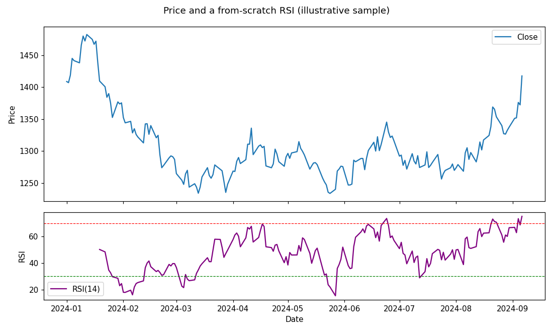
Follow the steps, because each is a tool from earlier chapters. diff gives the day-to-day change. Clipping keeps the positive changes as gains and the negative ones as losses (made positive). A 14-day rolling mean of each gives the average gain and average loss, whose ratio is the relative strength, and the RSI formula turns that ratio into a 0-to-100 number. The output shows the last few days with RSI in the low-to-mid 70s, and counts 6 days above 70 and 21 below 30 over the sample. The chart puts the price on top and the RSI in a panel below, with dashed lines at the conventional 70 and 30 levels. Every step is a diff, a clip, a rolling().mean(), a division, tools you already have, assembled into something that looks sophisticated but is not mysterious.
(This is a simplified RSI using plain rolling averages; the traditional version uses a particular smoothed average, which changes the exact numbers slightly but not the idea. Building the simple form first is how you understand the real one.)
What an indicator is, and is not
Here the honest note matters, and it echoes the technical-analysis and conditionals lessons. An indicator like RSI is a compact summary of what the price has already done, in this case recent momentum, and nothing more. The conventional readings, above 70 called overbought and below 30 oversold, are descriptions of that recent momentum, not instructions. It is tempting, especially once you can compute one, to treat RSI above 70 as a signal to sell and below 30 as a signal to buy, but a great many strong trends stay overbought for a long time while they keep rising, and cheap things get cheaper. An indicator computed from past prices cannot know the future, and being able to draw a clever line says nothing about whether trading on it makes money, exactly the caution from the conditionals chapter, now in a fancier costume.
So value indicators for what they are: concise ways to see an aspect of price behaviour, useful as one input among many and best understood, as here, by knowing exactly how they are built. Distrust anyone, including your own excitement, who presents an indicator crossing a line as a reason to trade on its own. Whether any rule built on an indicator has an edge is a question for the honest backtesting of the next part, not for the indicator itself. This is education, not advice.
What to carry forward
An indicator is arithmetic you already know: this RSI came from a diff, a clip, and a rolling mean, assembled into a 0-to-100 momentum measure and charted under the price, its 70 and 30 lines describing recent momentum rather than commanding a trade. Building one from scratch is how you see there is no magic in it, and the honest lesson holds: an indicator summarises the past and cannot predict, so a line crossing a level is not a signal to act on by itself.
That completes Part 4: you can turn prices into returns, trends, volatility, charts, and indicators. Part 5 puts it all together into a small research workflow, building a simple strategy and, crucially, testing it with clear eyes about the traps that make a backtest lie.