Course contents
Returns are not a bell curve
Quant models often assume returns are normally distributed, and they are not: real returns have fat tails, cluster their volatility, and change character across regimes. This chapter shows those properties in real data and warns that a model built on the bell curve will underestimate exactly the rare, large losses that matter most.
- Describe the real properties of return distributions (fat tails, volatility clustering, non-stationarity)
- Show why the normal-distribution assumption understates tail risk
- Connect regime change to the fading of edges
A great deal of finance theory assumes returns follow the normal distribution, the familiar bell curve. They do not, and the ways they depart from it are exactly the ways that matter most for survival. Real returns have fat tails, cluster their volatility, and change character over time. A quant who models returns as normal is building on a foundation that fails precisely when it is most needed, in a crash.
Fat tails
The most important departure is fat tails: extreme moves happen far more often than the bell curve says. Put a number on how badly the normal model fails.
# If daily returns were a normal bell curve, how rare would a big crash be? We
# compute the normal model's prediction, then note what really happens. Real
# returns have FAT TAILS: extreme moves happen far more often than the bell curve
# says, so any model built on the normal distribution underestimates crashes.
import numpy as np
from scipy import stats
import matplotlib
matplotlib.use("Agg")
import matplotlib.pyplot as plt

daily_vol = 0.01        # a 1% daily standard deviation, illustrative

print("If daily returns were NORMAL with a 1% standard deviation:")
for move in [0.03, 0.05, 0.07]:
    sigmas = move / daily_vol
    prob = stats.norm.sf(sigmas)                 # chance of a drop worse than `move`
    years = (1 / prob) / 252
    print(f"  a {move * 100:.0f}% down day is {sigmas:.0f} sigma -> "
          f"once every {years:,.0f} years")

print("\nYet markets see moves like these every few years. Returns have fat tails:")
print("extreme days are far more common than the bell curve predicts.")

# Illustration: a fat-tailed distribution (Student-t) against the normal, same
# scale. A log vertical axis makes the difference in the tails visible.
x = np.linspace(-0.06, 0.06, 400)
normal_pdf = stats.norm.pdf(x, 0, daily_vol)
t_pdf = stats.t.pdf(x / daily_vol, df=3) / daily_vol
plt.figure(figsize=(7, 4))
plt.plot(x * 100, normal_pdf, label="normal (thin tails)")
plt.plot(x * 100, t_pdf, label="fat-tailed (closer to real returns)")
plt.yscale("log")
plt.title("Real returns have fatter tails than the bell curve")
plt.xlabel("Daily return (%)")
plt.ylabel("Probability density (log scale)")
plt.legend()
plt.tight_layout()
plt.savefig("fat_tails.png", dpi=110)
print("Saved fat_tails.png")If daily returns were NORMAL with a 1% standard deviation: a 3% down day is 3 sigma -> once every 3 years a 5% down day is 5 sigma -> once every 13,843 years a 7% down day is 7 sigma -> once every 3,100,652,504 years Yet markets see moves like these every few years. Returns have fat tails: extreme days are far more common than the bell curve predicts. Saved fat_tails.png
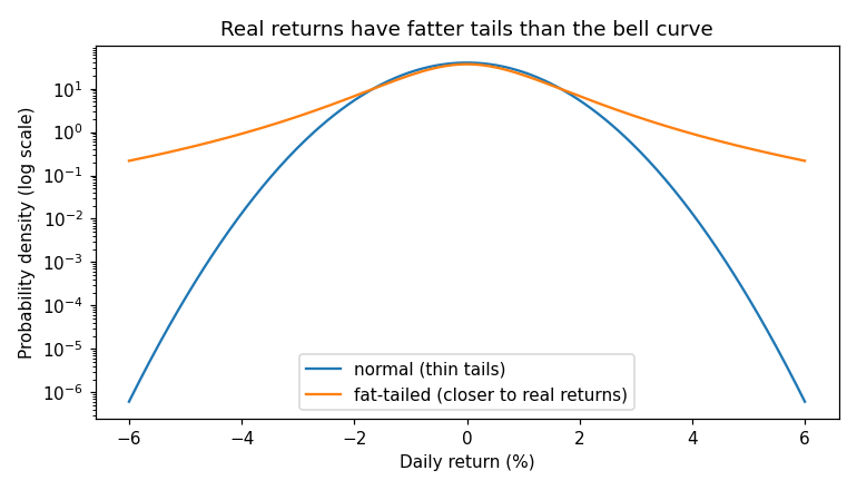
Under a normal distribution with a 1% daily standard deviation, a 3% down day is a once-in-three-years event, a 5% day happens about once every fourteen thousand years, and a 7% day about once every three billion years. Yet Indian and global markets deliver moves of that size every few years. The chart makes the gap visible: on a logarithmic scale, the fat-tailed distribution sits far above the normal in the tails, where the rare, ruinous days live. The lesson is severe. Any risk model built on the normal distribution will badly underestimate the frequency and the size of exactly the crashes that ruin people, which is why the value-at-risk measure in Part 5 must be treated with such caution.
Volatility clustering
Returns break the bell curve in a second way: their volatility is not constant, it clusters. Calm days tend to follow calm days, and violent days follow violent days, so a big move today makes a big move tomorrow more likely. Markets have quiet stretches and stormy stretches, and the storms arrive in bunches. This is why risk cannot be treated as a single fixed number. A strategy sized comfortably for a calm regime can be destroyed when volatility spikes and stays high, because the risk it took on quietly tripled while the position stayed the same.
Regimes and the fading of edges
The deepest problem is that the distribution itself changes over time, which statisticians call non-stationarity. The market of one decade is not the market of the next: interest rates, participants, regulation, and behaviour all shift, and relationships that held for years can simply stop holding. This is the statistical root of the alpha decay the final part covers. An edge measured cleanly in one regime can vanish in another, not because your test was wrong but because the world the test described no longer exists. It is why even a properly validated edge must be monitored and retired, and why the past, even measured perfectly, is an imperfect guide to a future that keeps changing its shape.
What to carry forward
Returns are not a bell curve, and the differences are the ones that matter. Fat tails mean crashes the normal model calls impossible happen every few years, so any normal-based risk model underestimates the losses that ruin people. Clustering volatility means risk is not a fixed number but rises and falls in bunches. And non-stationarity, the distribution changing across regimes, is the statistical reason even a genuine edge decays and must be retired. You now have the data foundations and their traps. The next part turns to the exciting half of the work, and treats it with the same skepticism: finding the quantifiable edges behind India's own factor indices.